Start with the artwork, not the press
The method is a production decision. It is not a style name you pick from a menu and hope the logo survives. On a natural 200 g/m² cotton canvas tote, the same file will not look or feel the same if it is screen printed, pressed on as a film, or printed into the cloth.
Look at the art before you name a process:
- Is it one solid color, or many?
- Are the edges meant to be sharp, or is the point a soft blend?
- Does the canvas have to stay visible through the color?
- How large is the mark, and does it print on one side or both?
- Is this a repeat logo you will run again, or a design that may change?
Those answers pick the method. The three routes below are the ones we use for the cotton totes on this site: 1-Color Screen Printing, DTF (Direct-to-Film) heat transfer, and DTP (Direct-to-Fabric) printing. None of them is a substitute for the others. A strike-off on the actual canvas is how you approve color, edge and hand.
1-Color Screen Printing
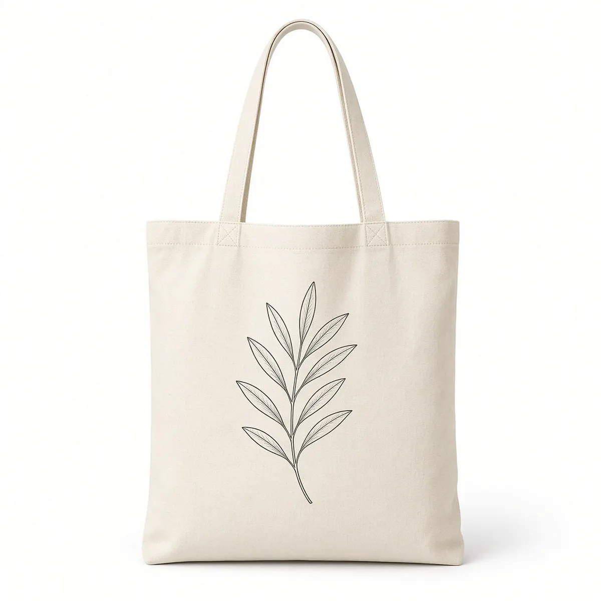
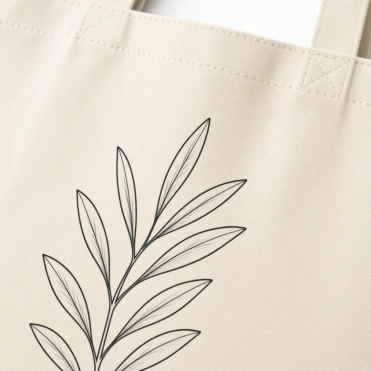
Screen printing puts one mixed ink through a stencil onto the canvas. It is the usual route for a bold logo or a line drawing in a single color.
How it is set up. The artwork is separated to one solid. That image is output as a film positive, or imaged directly onto the screen. The screen is a mesh stretched on a frame and coated with emulsion. Light hardens the emulsion where the film blocks nothing; the image area is washed open so ink can pass. The screen is then registered on the tote. Ink is flooded across the mesh and pulled through with a squeegee. Plastisol is cured with heat. A water-based textile ink is dried. Either way, the color is fixed before the bag is handled in bulk.
One color is one screen and one setup. A second color is a second screen, a second registration and a second pass. That is why a simple mark stays straightforward, and why a design with many solid colors stops being a “quick logo” job.
Ink on 200 g/m² canvas. Cotton canvas of this weight has a clear weave and enough body to take a screen. The ink sits on the yarns as a film. You can feel it. A light deposit still has a slight tooth. A heavier deposit feels smoother and thicker, and it covers the cloth more completely. The unprinted canvas stays as it was. Plastisol tends to sit more on the surface. A water-based textile ink bites a little more into the yarn and can feel softer, but it is still a surface color, not a dye that disappears into the cloth. Which ink we use is confirmed on the strike-off, against the hand you want.
Edge, gradient and color. A solid shape or a line prints with a crisp edge when the emulsion is clean and the line is heavy enough for the mesh. A finer mesh holds a thinner line and lays down less ink. A coarser mesh lays down more ink and is happier with a bolder mark. We choose the mesh from the art, not from a default.
A gradient is the wrong job for this method. A fade has to be broken into halftone dots. On canvas you will see the dots. If the design depends on a smooth blend, do not force it through one screen.
Color matching is the strength of the method. The ink is mixed to a swatch you send, or to a physical color standard. What you approve is that ink on this canvas, not the chip on white paper. A light ink on natural canvas looks warmer than the same ink on a coated sheet, because the cloth shows in any place the ink does not cover. Look at the strike-off in the same light you use for the rest of the line.
Artwork that suits it. Bold single-color logos, wordmarks, and line art: a leaf, a geometric rule, a crest drawn as one color. The olive-leaf tote and the geometric line print on the other side of that bag are this kind of art. See the Custom Cotton Canvas Tote Bag (YS-TT12).
File to send. Vector: AI, PDF or SVG. One solid spot, not a photograph placed into the file and called a logo. Convert strokes to outlines. Keep lines heavy enough that they will not close up on the mesh; if a line is the thing you are worried about, say so and we will check it before the screen is made. Do not leave the art in RGB and expect the ink to be mixed from the screen. Name the color, and send a swatch if the color is a brand color.
DTF (Direct-to-Film) heat transfer
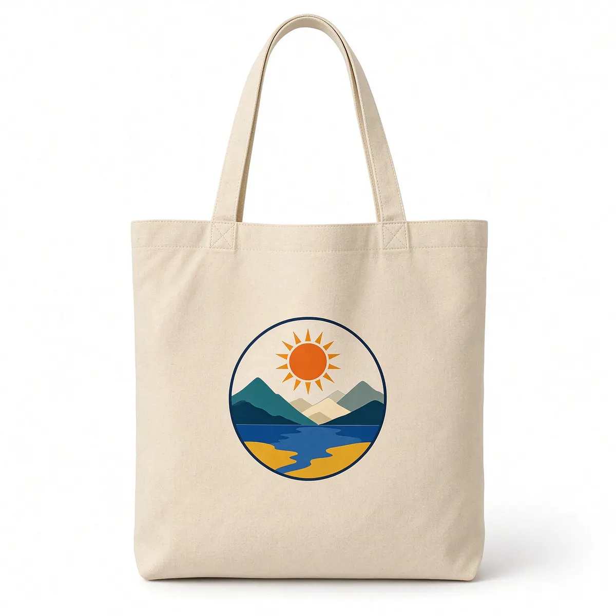
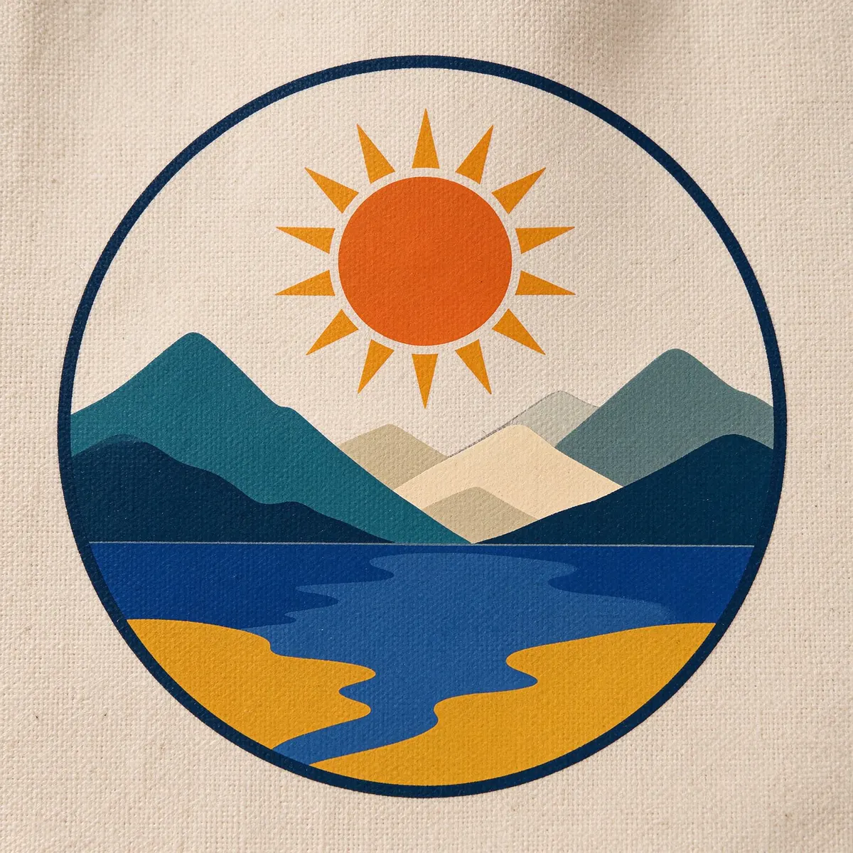
DTF (Direct-to-Film) heat transfer prints the artwork onto a film first, then bonds that film to the tote with heat. There is no screen.
How it is set up. The file is printed in mirror onto a clear film with a DTF printer. The inks are pigments. On natural canvas, a white underbase is printed on the film first, so the colors stay bright instead of mixing with the cream cloth. While the ink is still open, a hot-melt adhesive powder is applied and melted. The film is placed on the bag and heat-pressed. The carrier is peeled, hot or cold depending on the film. What remains is the graphic and a thin adhesive layer. Hot-peel and cold-peel films feel slightly different. We confirm which one on the strike-off.
There is no mesh, no emulsion and no screen to store. A change of artwork is a change of file, not a new stencil. Adding colors does not add a setup.
How it looks and feels on this canvas. The graphic sits on top of the weave. Run a finger from the bare canvas onto the print and you feel a slight film: smoother than the cloth, with an edge you can catch. The colors can be vivid because the white underbase stops the cream ground from greying them. Edges of a badge, a letter, or a hard shape stay sharp. That is the look of the sun, mountain and lake badge on the Custom Gusseted Cotton Canvas Tote Bag (YS-TT14).
A gradient is possible, because the printer can lay down a blend. The limit is the edge of the film. Where the art fades to nothing, the film still has a boundary. If that boundary is not designed, you will see a faint outline around the fade. Art for DTF should end on a deliberate edge, or on a shape that is meant to be seen as a patch. A watercolor that is supposed to dissolve into the canvas is the wrong file for this method.
Color matching. This is process color from the file, not a bucket of ink mixed to a chip. A bright brand orange that was specified as a spot color will be built from the process inks, and it can shift. The white underbase makes the print more even, and it also means you are matching a layered film, not a dyed yarn. Approve the color on a pressed piece of the same canvas. Do not approve it from the film alone, and do not approve it from the PDF on a bright monitor.
Artwork that suits it. Vivid multi-color artwork with crisp edges: badges, crests, illustrated marks, logos with several flat colors and a clean contour. Small placement prints are a natural fit, because the cost follows the area of the film rather than a screen.
File to send. A PNG with a transparent background, or a PDF, at the size it will be pressed. Build it at 300 ppi at that size. Keep the edges clean. A faint halo or a leftover white box becomes a visible film edge on the bag. State the finished width and the distance you want from the handle stitching and from any gusset fold. If the mark is a badge, include the transparent ground so we are not guessing where the film should stop.
DTP (Direct-to-Fabric) printing
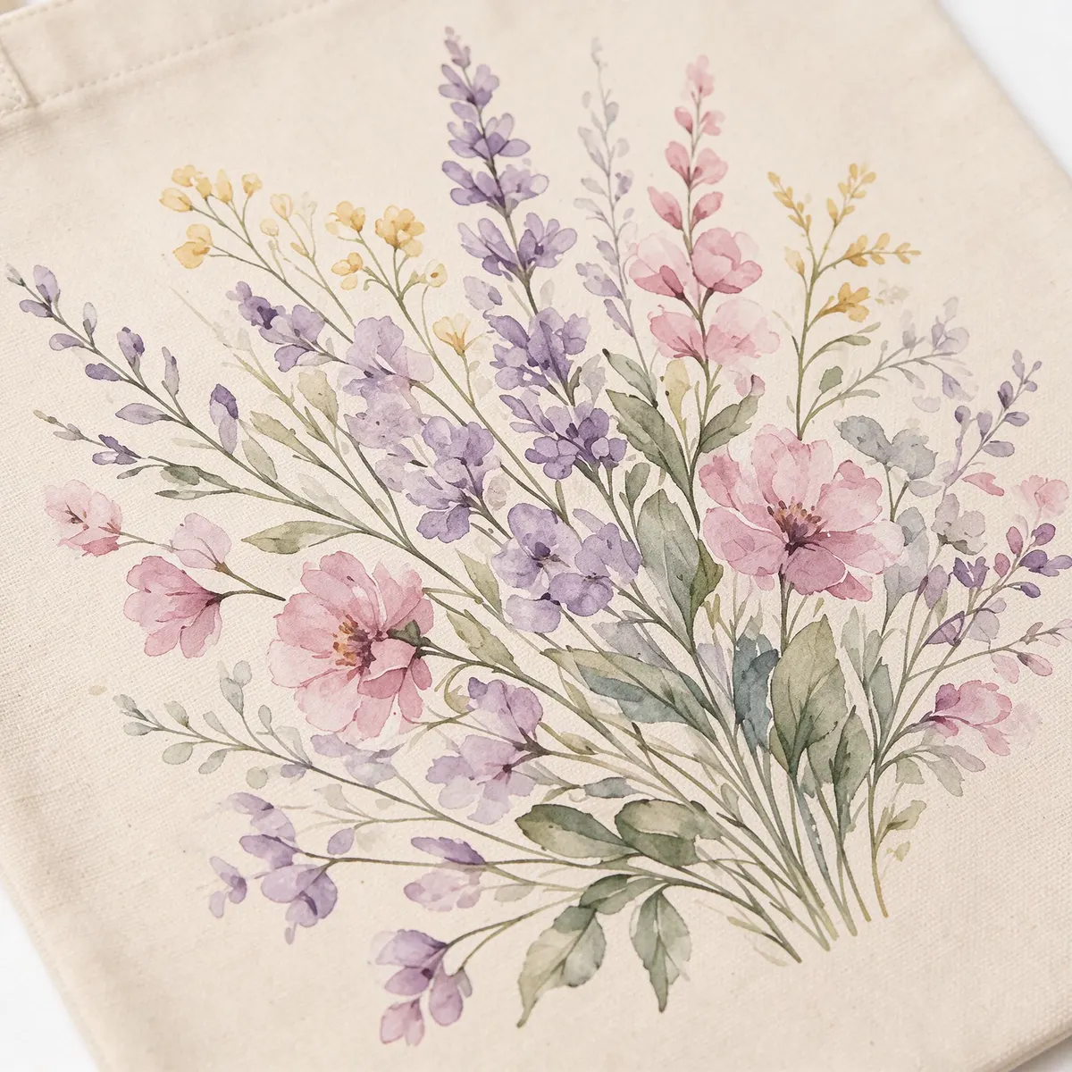
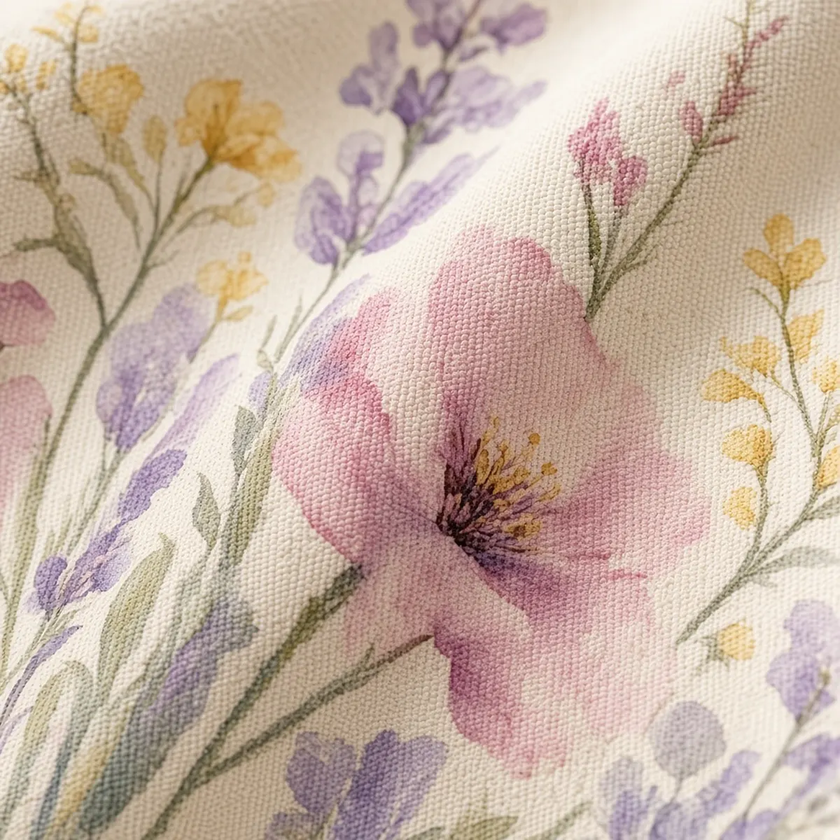
DTP (Direct-to-Fabric) printing puts the ink into the canvas. There is no screen and no film left on the surface.
How it is set up. The cloth is often pretreated so the ink stays in a controlled dot instead of wicking along the yarn. You do not see the pretreatment once the bag is printed. A textile printer then lays the image directly into the cotton. The ink is dried or heat-set so it is handleable. There is no carrier to peel and no stencil to register. A new design is a new file.
How it looks and feels. The color is in the yarns. The weave stays visible through the print, including in the darker parts of a flower. Run a hand from the printed area onto the bare canvas and the hand is close to the unprinted cloth. There is no skin of ink and no film edge. That is what you are looking at in the floral close-ups on the Custom Watercolor Cotton Canvas Tote Bag (YS-TT13): pink, purple, yellow and green sitting in the canvas, not on it.
Edges are softer than DTF. A thin rule or a small serif can break up where the yarns cross. That is not a failed print. It is the cloth. If the design needs a razor edge on small type, DTP is the wrong method. If the design is a wash of color, the weave is part of the result, and it is the reason to choose this route.
Gradients and color. Continuous tone is what this method is for. A watercolor, a soft blend, a floral that moves from one color into another without a hard stop. The printer is not trying to imitate a halftone screen, and you should not see a dot pattern as the way the fade is made.
Color is process color plus the cloth. Natural 200 g/m² canvas is not white. Every tint is ink mixed with that cream ground. Pale colors pick up more of the canvas. Deep colors cover more of the yarn but the texture still reads. A swatch matched on white paper will look different here. Approve a strike-off on the same canvas, and look at the lightest part of the art as carefully as the darkest.
Artwork that suits it. Full-color art whose point is a soft gradient: watercolor, a painted floral, a blend that should feel like part of the fabric. It is a poor home for a one-color line logo that has to match a spot color exactly. That logo belongs on a screen.
File to send. A continuous-tone file, PNG, TIFF or PDF, at print size. 150 to 300 ppi at that size is enough for this cloth; more resolution will not make a thin serif sharper than the weave. Do not outline every flower in the hope of a DTF-style edge. Leave the blends as blends. Include a preview placed on a cream ground, because that is the color the canvas will add. Tell us the finished width and whether the art goes on one side or both.
How the three compare
| Question | 1-Color Screen Printing | DTF (Direct-to-Film) heat transfer | DTP (Direct-to-Fabric) printing |
|---|---|---|---|
| Setup | One screen per color, from film or a direct exposure | No screen. Print the film, powder it, heat-press it | No screen. Print the ink into the cloth |
| Where the color sits | On the yarn, as an ink film | On top of the canvas, as a bonded film | In the yarn |
| Edge | Crisp on solid shapes and line art | Sharpest multi-color edge; the film has a cut boundary | Softer; the weave breaks a thin line |
| Gradients | A fade becomes visible dots | Possible, but a fade to nothing shows the film edge | The natural home for soft, continuous color |
| Hand on 200 g/m² canvas | A light skin of ink; a heavier deposit feels thicker | A smooth film you can feel against the cloth | Close to unprinted canvas |
| Color matching | One mixed ink, matched to a swatch | Process color from the file, with a white underbase on natural canvas | Process color, shifted by the cream cloth |
| Best artwork | Bold single-color logos and line art | Vivid multi-color art with crisp edges | Full-color soft gradients, such as watercolor |
| File to send | Vector, one solid spot color | PNG or PDF at size, transparent ground, crisp edges | Continuous-tone file at print size |
| Most cost-effective for | Simple 1-color logos at volume | Multi-color art and smaller runs, where cost follows print area | Full-color gradients, where cost follows print area and coverage |
What drives the cost
There is no single “print upcharge” that fits all three. The quote moves with the artwork, the print size, the quantity and whether one side or both sides are printed. A second side is a second print operation. If the two sides use different art, send both files.
1-Color Screen Printing has a one-off screen setup for each color. That setup is paid once and then spread across the run, so the unit cost drops sharply as the quantity rises. For a simple 1-color logo at volume, this is usually the most economical of the three. A larger mark still uses more ink and a larger screen, but the screen does not get made again for every bag. Extra colors do not come free: each one is another screen and another pass.
DTF (Direct-to-Film) heat transfer has no screens. The number of colors does not add a setup, which is why a multi-color badge does not get more expensive just because it contains more hues. The cost is driven by the print area. A small chest mark and a large front graphic are different jobs even when they come from the same file. This is the sensible route for multi-color artwork and for smaller runs, where a screen would be a large share of the cost and the art may still change.
DTP (Direct-to-Fabric) printing also needs no screens, so color count is not the driver. It handles full-color gradients. The cost follows the print area and the coverage: how much of that area actually carries ink. A sparse watercolor and a field of color that fills the panel are not the same coverage, even at the same width and height.
Tell us the quantity you actually expect to repeat. A method that is sensible at one volume can be the wrong tool at another, and we would rather say so before a screen is made or a film is printed.
How to choose
Use the art and the run, in that order.
- One solid color, a logo or a line drawing, and a quantity you will repeat. 1-Color Screen Printing. Send vector art and a swatch.
- Several colors, a hard edge, a badge or a small placement, including a shorter run. DTF (Direct-to-Film) heat transfer. Send a transparent file at size, and design the edge on purpose.
- A painting, a watercolor, or any full-color blend that should feel like the cloth. DTP (Direct-to-Fabric) printing. Send continuous-tone art, and expect the canvas to show through.
If the file contains both a crisp logo and a soft background, do not average them into a compromise. Either split the methods, or decide which part a buyer will judge first and protect that. We will tell you which route holds it.
Keep the print off the handle stitching and off a gusset fold. On a flat tote the front is one panel. On a gusseted tote the front is a boxed panel, and a mark that runs into the side fold will crack visually even when the print itself is sound. Mark the placement on a photo of the bag, with the distance from the top seam.
Questions buyers ask
Can one tote use more than one of these methods?
Yes. A 1-color screen print on one panel and a DTF badge on the other is a normal brief. Each method is placed, specified and approved on its own. The quote treats them as separate print operations.
Will a brand color match the same way on all three?
No. Screen printing mixes one ink to a swatch, so a spot color is the closest match of the three. DTF and DTP build color from process inks, and natural canvas shifts the result. Send a swatch and approve a strike-off. Do not approve a brand color from a monitor.
What should I send if I have not chosen a method?
Send the logo as vector and any full-color art as a high-resolution PNG or PDF, the size on the bag, and whether you print one side or both. Say what must survive: a solid spot color, a crisp multi-color edge, or a soft gradient. We will tell you if the file and the method disagree.
Does a larger logo change the quote when the color count does not?
Yes. DTF and DTP follow print area and coverage, not the number of colors. Screen printing still uses one screen per color, but a larger mark needs a larger screen and more ink. Send the finished size. The quote also changes if the second side is printed.
If you are ready to brief a factory
Dongguan Yishu Handbag Products Technology Co., Ltd. is a direct OEM/ODM bag factory in Dongguan, China. The totes linked above are reference styles. A style that is not shown can be developed from your design, sample or tech pack.
The reference MOQ is 500 pieces per confirmed configuration. Special material, hardware or multiple colorways may change the final MOQ. Bulk production is typically 15–20 days, confirmed per order after sample approval, material review and order confirmation. Programs are planned to move through the six checkpoints on the quality page: requirement review, material check, pre-production sample, in-line inspection, final inspection, and packing release.
If you would like a print method reviewed against your artwork, send the file, the target quantity and which side or sides are printed through the inquiry form, or write to sales@yishubags.com. We will usually reply with the method we recommend and what the strike-off needs to prove.